Posts tagged "HOW-TO"

urban landscape in mist and trees silhouettes

Project Malaysia AirWatch – Air Quality Index Using FAVORIOT

August 29th, 2026 Posted by BLOG, HOW-TO, Internet of Things, IOT PLATFORM, PRODUCT, SMARTCITY 0 thoughts on “Project Malaysia AirWatch – Air Quality Index Using FAVORIOT”

Crowdsourced Air-Quality Monitoring Using the FAVORIOT Developer Plan

1. Project concept

Malaysia AirWatch is a citizen-supported air-quality monitoring project. Schools, universities, community groups, businesses and individual volunteers install low-cost sensor stations at their locations.

Each station measures local air conditions and sends the readings to the FAVORIOT platform. The combined data appears on a public map showing air-quality patterns across Malaysia.

The project does not replace the Department of Environment’s official monitoring stations. It provides denser, neighbourhood-level observations that may help people identify local changes, pollution hotspots and unusual events.

The basic flow is:

flowchart LR
    A["Community sensor"] --> B["Wi-Fi or 4G"]
    B --> C["FAVORIOT"]
    C --> D["Quality checks"]
    D --> E["Public map"]
    D --> F["Alerts and analysis"]

2. Project objectives

The project should pursue five clear objectives:

  1. Collect PM2.5 and PM10 data from many Malaysian locations.
  2. Build a public community air-quality map.
  3. involve schools, universities and citizens in environmental monitoring.
  4. Detect unusual pollution patterns at neighbourhood level.
  5. Create a national dataset for education, research and public awareness.

A good pilot target would be:

  • 100 monitoring stations
  • At least 10 states
  • Urban, suburban and rural locations
  • One reading every five minutes
  • Six months of continuous operation
  • At least 85% station uptime

3. Why the FAVORIOT Developer Plan fits

The current Developer Plan costs RM300 per month or RM3,000 per year. It includes:

  • 500,000 API calls per day
  • Unlimited devices
  • Unlimited private and public dashboards
  • Up to 30 widgets per dashboard
  • Map widgets
  • Device connectivity status
  • Data import and export
  • Edge Gateway
  • Firmware OTA
  • Advanced analytics and machine-learning models
  • Email and Telegram notifications
  • HTTP POST forwarding to external systems
  • Customer accounts with designated access
  • One-year data retention

These features make it suitable for a national crowdsourcing pilot. ⁠FAVORIOT pricing page

Estimated platform capacity

If each station sends one message every five minutes:

288\ messages\ per\ station\ per\ day

Number of stationsMessages per dayDeveloper Plan usage
10028,8005.8%
500144,00028.8%
1,000288,00057.6%
1,500432,00086.4%

Theoretically, one Developer Plan can support about 1,700 stations at five-minute intervals. A safer operational ceiling would be around 1,300 to 1,500 stations, leaving capacity for testing, device management, retries and external applications.

4. Choose what the stations will measure

Required measurements

Every station should measure:

  • PM2.5
  • PM10
  • Temperature
  • Relative humidity

Temperature and humidity matter because low-cost particulate sensors can be affected by environmental conditions.

Optional measurements

Selected research-grade stations may also measure:

  • Carbon dioxide
  • Carbon monoxide
  • Nitrogen dioxide
  • Ozone
  • Volatile organic compounds
  • Atmospheric pressure
  • Noise level

I would not put every sensor into the first version. Gas sensors can produce misleading readings without proper calibration. Start with PM2.5, PM10, temperature and humidity.

5. Build the standard AirWatch station

Recommended components

ComponentPurpose
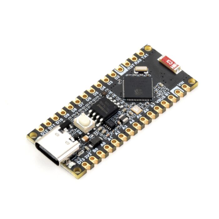
ESP32 development boardReads sensors and sends data
PMS5003, PMS7003 or SPS30Measures PM2.5 and PM10
BME280 or SHT31Measures temperature and humidity
Wi-Fi connectivitySends data through the host’s internet connection
Weather-resistant enclosureProtects the electronics
Ventilation openingsAllows air to reach the sensor
5V power supplyPowers the station
Unique QR codeIdentifies and registers the station

For locations without Wi-Fi, use:

  • 4G LTE router or modem
  • LoRaWAN gateway where local coverage exists
  • Store-and-forward memory when connectivity is interrupted

Estimated hardware cost

Station typeEstimated cost
Basic educational stationRM180–RM300
Better outdoor community stationRM350–RM650
4G-connected stationRM600–RM1,000
Reference or calibration stationRM3,000 and above

These are planning estimates. The final cost depends on sensor model, enclosure, power and connectivity.

6. Define where sensors may be installed

Participants should place stations:

  • Under a sheltered outdoor area
  • Between 1.5 and 3 metres above ground
  • Away from kitchen exhausts
  • Away from cigarette-smoking areas
  • Away from direct rain
  • Away from air-conditioning outlets
  • With unrestricted airflow
  • Where the Wi-Fi signal is stable
  • Where power is continuously available

The project should record the installation environment:

  • Roadside
  • Residential
  • School
  • University
  • Industrial vicinity
  • Commercial
  • Rural
  • Agricultural
  • Coastal
  • Forest-edge

Without this context, two readings may appear comparable when they are actually taken under very different conditions.

7. Create the FAVORIOT project structure

Create the following hierarchy in FAVORIOT:

Project

Malaysia AirWatch

Applications

  • Community Air Quality Monitoring
  • Station Health Monitoring
  • Research and Analytics
  • Public Air Quality Map

Groups

Groups can represent states:

  • Johor
  • Kedah
  • Kelantan
  • Melaka
  • Negeri Sembilan
  • Pahang
  • Penang
  • Perak
  • Perlis
  • Sabah
  • Sarawak
  • Selangor
  • Terengganu
  • Kuala Lumpur
  • Putrajaya
  • Labuan

For a larger deployment, create subgroups using districts or station categories.

Device naming convention

Use a consistent device ID:

MY-[STATE]-[DISTRICT]-[NUMBER]

Examples:

  • MY-SGR-PUCHONG-001
  • MY-JHR-JB-003
  • MY-SWK-KUCHING-012

Do not use a volunteer’s name, house address or telephone number in the device ID.

8. Design the data payload

Each station should send a consistent JSON payload:

{
  "device_developer_id": "MY-SGR-PUCHONG-001@username",
  "data": {
    "pm1": 8.4,
    "pm25": 18.7,
    "pm10": 31.2,
    "temperature": 29.8,
    "humidity": 71.4,
    "latitude": 3.0321,
    "longitude": 101.6185,
    "location_type": "residential",
    "firmware_version": "1.0.0",
    "sensor_model": "PMS5003",
    "wifi_rssi": -63,
    "uptime_seconds": 86420,
    "quality_flag": "raw"
  }
}

FAVORIOT supports HTTPS, MQTT, WebSocket and CoAP for device connectivity. Each device can be given its own access token rather than sharing the account’s main API key. ⁠FAVORIOT platform documentation

9. Protect participant privacy

Exact household coordinates should not be displayed publicly.

Use two location levels:

  • Exact coordinates: kept in the private administration records.
  • Public coordinates: rounded or displaced by approximately 500 metres to 1 kilometre.

Public participants should see only:

  • Station ID
  • General area
  • District and state
  • Latest readings
  • Historical trend
  • Station status
  • Sensor type
  • Last update time

The registration form should explain:

  • What information will be collected
  • Which information will be public
  • Who owns the contributed data
  • How the data may be used
  • How participants can withdraw
  • Whether researchers may download the dataset

10. Develop the sensor firmware

The ESP32 firmware should perform these steps:

  1. Start the particulate, temperature and humidity sensors.
  2. Connect to Wi-Fi.
  3. Synchronise the clock.
  4. Allow the particulate sensor to stabilise.
  5. Take several readings.
  6. Remove clearly invalid measurements.
  7. Calculate a short average.
  8. Send the payload to FAVORIOT over HTTPS or MQTTS.
  9. Confirm successful transmission.
  10. Save failed readings locally.
  11. Retry when connectivity returns.
  12. Report station-health information.
  13. Check for firmware updates.

Recommended sampling:

  • Read sensors every 30 seconds.
  • Calculate the median or trimmed mean over five minutes.
  • Send one consolidated message every five minutes.

This reduces noise and consumes fewer API calls than transmitting every raw reading.

11. Test ten prototype stations

Do not immediately distribute 100 stations. Build ten prototypes first.

Place them in several conditions:

  • Two beside an official or trusted reference station
  • Two at universities
  • Two at schools
  • Two in residential areas
  • One near a busy road
  • One in a rural area

Run them for four weeks. During testing, check:

  • Differences between units
  • Humidity effects
  • Missing data
  • Sensor drift
  • Wi-Fi failures
  • Heat inside the enclosure
  • Rain protection
  • Firmware stability

Put all ten units beside one another for several days before deployment. This co-location test reveals whether one sensor consistently reads higher or lower than the others.

12. Create data-quality rules

Crowdsourced measurements require visible quality labels.

Suggested quality flags

FlagMeaning
VerifiedStation has passed co-location and installation checks
ProvisionalStation is operating but has limited validation
SuspectReading failed one or more quality tests
OfflineNo data received within the expected period
MaintenanceStation is being serviced
RejectedReading is physically impossible or corrupted

Automatic checks

Flag a reading when:

  • PM2.5 or PM10 is negative
  • PM2.5 is far higher than PM10
  • Temperature or humidity is outside plausible limits
  • The same reading repeats for an unusually long time
  • The value changes too sharply between intervals
  • The station has weak connectivity
  • The device clock is wrong
  • Readings diverge greatly from nearby stations

A high reading from one low-cost station should be treated as a signal to investigate, not proof of a pollution incident.

13. Build the FAVORIOT dashboards

Public national dashboard

Include:

  • Map of all active stations
  • Latest PM2.5 readings
  • Colour-coded air-quality categories
  • National average
  • Highest current readings
  • State comparison
  • Twenty-four-hour trend
  • Last update time
  • Explanation of the quality flags
  • Clear non-regulatory disclaimer

State dashboard

Include:

  • State map
  • District comparison
  • Hourly PM2.5 and PM10 trends
  • Seven-day trend
  • Active and offline stations
  • Locations with unusual readings

Technical dashboard

Keep this private for administrators:

  • Device connectivity status
  • Wi-Fi strength
  • Last message time
  • Firmware version
  • Sensor age
  • Missing-data rate
  • Battery or power status
  • Stations requiring maintenance

Research dashboard

Include:

  • PM2.5 versus humidity correlation
  • Weekday versus weekend patterns
  • Morning and evening peaks
  • Urban versus rural comparisons
  • Seasonal trends
  • Anomaly detection
  • Time-series forecasts

14. Configure rules and alerts

Create platform rules for:

Air-quality alerts

  • PM2.5 exceeds the project threshold for three consecutive readings
  • PM10 rises sharply within 30 minutes
  • Several nearby stations detect the same increase

Station-health alerts

  • No data for 20 minutes
  • Device repeatedly reconnects
  • Wi-Fi strength remains poor
  • Sensor produces fixed values
  • Firmware is outdated

Send technical alerts to the project team through Telegram or email. Avoid sending public health alerts until the measurements and interpretation method have been properly reviewed.

15. Recruit contributors

Potential participants include:

  • Public and private universities
  • Secondary schools
  • TVET institutions
  • Local councils
  • Resident associations
  • Environmental NGOs
  • Makerspaces
  • Technology companies
  • Factories and industrial parks
  • Farms and plantations
  • Citizen scientists

Participation models

Sponsor a station

A company pays for stations to be installed at schools or community centres.

Build your own station

Universities, students and makers assemble a station using the approved design.

Host a station

FAVORIOT supplies the station while the participant provides electricity, Wi-Fi and a suitable location.

Research partner

A university supports calibration, analysis and publication.

16. Create the contributor onboarding process

Every participant follows the same steps:

  1. Apply through an online form.
  2. Provide the general proposed location.
  3. Choose to build, sponsor or host a station.
  4. Accept the data-sharing and privacy terms.
  5. Receive a station ID and QR code.
  6. Follow the installation guide.
  7. Upload installation photographs.
  8. Run the station for a seven-day probation period.
  9. Pass the data-quality review.
  10. Appear on the public map.

The QR code can open the public station page and display its readings, history and validation status.

17. Run a 12-week pilot

WeekMain activityOutput
1Confirm objectives, governance and measurementsProject charter
2Select sensors and design enclosureHardware specification
3Configure FAVORIOT hierarchy and payloadWorking platform structure
4Develop ESP32 firmwareFirst connected prototype
5Assemble ten unitsPrototype fleet
6Conduct co-location testingBaseline comparison
7Improve hardware and correction methodRevised station
8Install at pilot sitesLive field data
9Create dashboards and mapsPublic beta dashboard
10Configure alerts and quality rulesMonitoring workflow
11Recruit first community participantsInitial contributor network
12Review results and approve expansionPilot report

18. Pilot budget

Ten-station pilot

ItemEstimated cost
Ten sensor stations at RM450RM4,500
Spare sensors and componentsRM1,000
Enclosures and installation materialsRM800
FAVORIOT Developer Plan, one yearRM3,000
SIM and data for selected sitesRM600
Calibration and field visitsRM2,000
Workshops and participant materialsRM1,500
ContingencyRM1,500
Estimated totalRM14,900

Internal staff time, travel across Malaysia and the development of a separate public web application would need their own allocation.

19. Success indicators

Technical indicators

  • At least 85% station uptime
  • At least 95% valid readings
  • Less than 10% missing data
  • Data delivered within ten minutes
  • All stations remotely identifiable
  • Firmware updates completed without visiting every station

Participation indicators

  • Ten states represented during the first phase
  • At least 20 partner organisations
  • At least 100 active contributors
  • At least five participating universities
  • At least ten participating schools

Data indicators

  • Six months of usable observations
  • Verified co-location results
  • Published data-quality method
  • Monthly community air-quality reports
  • At least three research or student projects using the data

20. How the project can grow

Phase 1: Ten-station technical pilot

Prove the sensor, firmware, platform and data-quality process.

Phase 2: One hundred community stations

Expand through universities, schools and resident associations.

Phase 3: Five hundred stations

Bring in local councils, corporate sponsors and environmental groups.

Phase 4: National operational network

Move to an Enterprise or dedicated arrangement when the project needs:

  • Multiple administrative organisations
  • Longer data retention
  • Higher API volume
  • Dedicated infrastructure
  • Formal service levels
  • Stronger data-governance controls
  • Links with government or emergency systems

21. Important public disclaimer

The dashboard should carry a clear statement:

Malaysia AirWatch uses low-cost community sensors to provide local environmental observations. Its readings are indicative and may be affected by sensor accuracy, placement, humidity and maintenance. The data should not be treated as an official Malaysian Air Pollutant Index or used alone for medical, regulatory or emergency decisions. Refer to the relevant Malaysian authorities for official air-quality information.

Suggested project message

Your neighbourhood’s air should not be invisible.

Malaysia AirWatch allows schools, universities, communities and citizens to help measure the air around them. One sensor may tell us what is happening at one location. Hundreds of connected sensors can help us see patterns across the country.

Build a station. Host a station. Sponsor a community. Help Malaysia see the air we breathe.

How to Estimate the Cost of a Blind Spot

How to Estimate the Cost of a Blind Spot (Operational Blindness)

August 13th, 2026 Posted by BLOG, HOW-TO, Internet of Things, Operational Blindness 0 thoughts on “How to Estimate the Cost of a Blind Spot (Operational Blindness)”

Most organizations never calculate what their blind spots actually cost them. Delays, uncertainty, repeated failures, manual checking, rework, energy waste, missed alerts, and poor reporting all get accepted as normal operating friction. Nobody puts a number on it because nobody is asked to.

This is the single biggest reason visibility projects stall at the budget stage. Without a number, a proposal to close a blind spot competes against every other line item as a nice-to-have. With a number, it becomes a comparison: the cost of staying blind versus the cost of seeing clearly. That comparison is what moves a project from “interesting” to “approved.”

This article walks through how to estimate the cost of a blind spot in a way that is defensible, fast enough to use in early discovery, and credible enough to bring to an executive.

Why the cost of blindness is rarely calculated

Operational blindness is invisible by definition. When a machine fails without warning, the organization sees the repair bill, not the six weeks of undetected wear that preceded it. When a report takes three days to compile manually, the organization sees the report, not the labor hours buried inside it. The cost is real, but it is scattered across departments, absorbed into “the way things are,” and rarely tied back to the missing visibility that caused it.

The estimate does not need to be perfect. In early discovery, it needs to be clear enough to show whether the problem deserves attention at all. A rough number that says “this blind spot is costing roughly RM 40,000 a month” is more useful than a precise number that takes three months to produce.

The six cost areas to check

Blind spots rarely cost money in only one way. Before estimating, work through these six areas and ask which ones apply to the specific blind spot in front of you.

Downtime. How many hours are lost per month because a failure or deviation was detected late instead of early? This is usually the most visible cost and the easiest to find in maintenance logs, production records, and incident reports.

Energy waste. Which assets consume energy without producing business value, because nobody can see they are running idle, overcooling, or malfunctioning? Meter data, equipment schedules, and occupancy records usually hold the answer.

Manual work. How many staff hours go into checking, copying, or reconciling data that should already be visible? Look at the report process itself, who owns each step, and how long the spreadsheet trail has been in place.

Compliance risk. Which metrics are hard to prove during an audit because the underlying data was never captured automatically? Regulatory reports, source records, and exception files reveal where the gaps sit.

Response delay. How long passes between an event happening and someone acting on it? Alert logs, communication records, and workflow timestamps show the real lag, which is usually longer than anyone assumes.

Customer impact. Which visibility gaps show up in complaints, missed service levels, or support tickets? This is the cost area most likely to be underestimated, because it shows up as churn and reputation damage rather than a line item.

A single blind spot can touch more than one of these areas at once. A missed maintenance alert, for example, carries downtime cost, energy waste, and customer impact together. Estimating each area separately and then adding them keeps the final number honest instead of inflated.

A simple estimation method

For each cost area that applies, work through three questions.

First, how often does the blind spot occur. A weekly event and a quarterly event carry very different annualized costs, so get a real frequency, not an impression.

Second, what is the cost per occurrence. This can be a repair bill, a headcount hour rate multiplied by hours lost, a wasted kilowatt-hour rate, or an estimated revenue impact per incident. Where a hard number does not exist, use a conservative range rather than skipping the category.

Third, multiply frequency by cost per occurrence to get an annualized figure for that area, then sum across all applicable areas.

This produces a defensible range, not a single decimal-point figure, and a range is exactly what is needed at this stage. Precision comes later, once instrumentation is in place and the numbers can be measured directly instead of estimated.

Where to get the evidence

Estimates built on guesses do not survive a conversation with finance. Each cost area has a natural evidence trail already sitting inside the organization.

Downtime numbers live in maintenance logs, production records, and incident reports. Energy waste shows up in meter data, equipment schedules, and occupancy records. Manual work is documented, even informally, in the report process itself, staff roles, and spreadsheet history. Compliance risk is visible in regulatory reports, source records, and exception files. Response delay is timestamped in alert logs, communication records, and workflow systems. Customer impact is already tracked in complaints, SLA records, and service tickets.

Asking for recent, specific examples produces better numbers than asking for general opinions. What happened last week. Which asset failed most recently. Which report arrived late. Which alert was missed. Which customer complained. Recent stories carry texture that a broad estimate cannot, and they anchor the cost calculation to something real rather than theoretical.

Turning the number into a decision

Once the cost of blindness is visible, the conversation changes shape. The project stops being a request to buy a platform or add sensors, and becomes an investment case to reduce a specific, quantified risk or capture a specific, quantified opportunity.

The comparison that matters is simple: the cost of building visibility against the cost of remaining blind. If closing a blind spot costs less than what the blindness is already costing every year, the case makes itself. If it costs more, that is useful information too. It tells the team to look for a smaller blind spot with a clearer payback, or to combine several blind spots into one investment that clears the bar together.

This is also why the estimate belongs early in the discovery process, not at the end. It shapes which blind spots get prioritized, which stakeholders need to be in the room, and how the eventual proposal gets framed. A proposal built around a quantified cost of blindness reads as consultative rather than product-led. The organization sees its own problem reflected back with a number attached, and the number is what makes the next conversation, about budget, easy instead of speculative.

The habit worth building

The organizations that manage this well do not treat cost-of-blindness estimation as a one-time exercise before a project starts. They build it into how they evaluate every operational gap that surfaces afterward. Every missed alert, every delayed report, every manual reconciliation becomes a small case study, and over time the organization develops a working library of what blindness actually costs across its operations.

That library is worth more than any single estimate. It turns “we think this matters” into “here is what it has cost us before,” and that shift, from intuition to evidence, is what separates organizations that fund visibility projects from organizations that keep accepting friction as normal.

Cost of Blindness Calculator | FOBA
FOBA · Find Phase Tool

Cost of Blindness Calculator

Operational blindness has a cost, but most organizations never calculate it. Estimate what a blind spot is really costing across six areas, then compare it against the cost of closing it.

Estimated annual cost of blindness
RM 0
RM 0 / month
Cost areas active
0 / 6
areas with a non-zero estimate
Largest contributor
no data yet

Annual cost by area

Visibility investment comparison

The cost of visibility should be compared against the cost of remaining blind. Enter the estimated cost of the project that would close this blind spot.

VS
Enter a project cost to compare it against the estimated cost of blindness.
Based on FOBA Chapter 6.7, Finding the Cost of Blindness. Estimates are directional, meant to show whether a blind spot deserves attention, not a substitute for a full financial audit.

Reducing Machine-Downtime Blindness With Favoriot

August 11th, 2026 Posted by BLOG, HOW-TO, Internet of Things, IOT PLATFORM, Operational Blindness 0 thoughts on “Reducing Machine-Downtime Blindness With Favoriot”

The Afternoon Everything Stopped

A production line goes quiet at 2:14 in the afternoon. Nobody on the floor knows why yet. The supervisor is walking the line asking the operator what happened. The operator is checking the panel. Someone has already called the maintenance contractor, just in case, because waiting to find out feels riskier than being wrong. Forty minutes pass before anyone has a real answer, and by then the shift’s output target is no longer realistic.

I have watched a version of this scene play out in more factories than I can count, and what strikes me every time is that it is rarely a story about broken equipment. It is a story about not knowing. The machine had already been signaling something was wrong. A vibration pattern had drifted. A motor had been running hotter than usual for three days. A pressure reading had crept past its normal range that same morning. The information existed. It just was not seen by anyone who could act on it in time.

That gap between having data and having sight is what I call downtime blindness, and it is a far more expensive problem than most operations teams realize.

What Downtime Blindness Actually Costs

The numbers are worth sitting with for a moment. Fluke’s 2025 downtime survey found that manufacturers are losing up to $852 million a week industry-wide to unplanned outages, with the average hour of downtime running around $1.7 million once lost production, idle labor, and recovery costs are added up. A few figures from that same survey stand out:

  • Frequency: Nearly half of manufacturers report six to ten downtime incidents every single week.
  • Duration: 45% of outages last up to twelve hours, and 15% stretch as long as seventy-two.
  • Prevalence: More than six in ten manufacturers experienced unplanned downtime in the past year.

These are not rare, catastrophic failures. They are a steady drip of small stoppages that quietly adds up to a very large number by the end of the quarter.

More Sensors Is Not the Same as More Sight

The instinct when a plant hears numbers like these is to reach for more sensors, and I understand the appeal. More data feels like more control. But I have seen plants add a dozen new sensors and still get caught off guard by the same kind of stoppage six months later, because the new readings simply landed in yet another dashboard nobody had time to check.

Adding instrumentation without adding a way to see across it does not close the blindness. It just makes the blind spot slightly better lit.

Most plants are not actually short on data to begin with. Walk into any mid-sized facility and you will typically find:

  1. PLCs logging cycle times and machine states.
  2. Sensors tracking temperature, vibration, and pressure.
  3. SCADA systems recording alarms as they happen.
  4. Maintenance software full of work orders nobody has time to read.

The instrumentation exists. What is usually missing is a connected view that turns all of that into something a supervisor can glance at and understand in five seconds, not five separate screens.

The Problem Sensors Cannot Fix: Retiring Expertise

There is a second layer to this problem that gets less attention than it deserves, and it has nothing to do with sensors at all. It is about people.

A recent industry analysis pointed out that a large share of manufacturing maintenance teams are watching their most experienced technicians retire, and that junior technicians can take three to three and a half times longer to diagnose the same fault. The instinct an experienced tech develops after twenty years, the ability to hear a bearing going bad before it shows up on any gauge, does not transfer automatically to the next generation. When that knowledge walks out the door, the plant does not just lose a person. It loses a diagnostic capability that took decades to build, and the blindness gets worse even though the sensors stay exactly the same.

So the real question is not whether a factory has enough data. It is whether that data has been connected into something the whole team can see and act on together, in a way that does not depend entirely on one person’s memory of what a strange noise usually means.

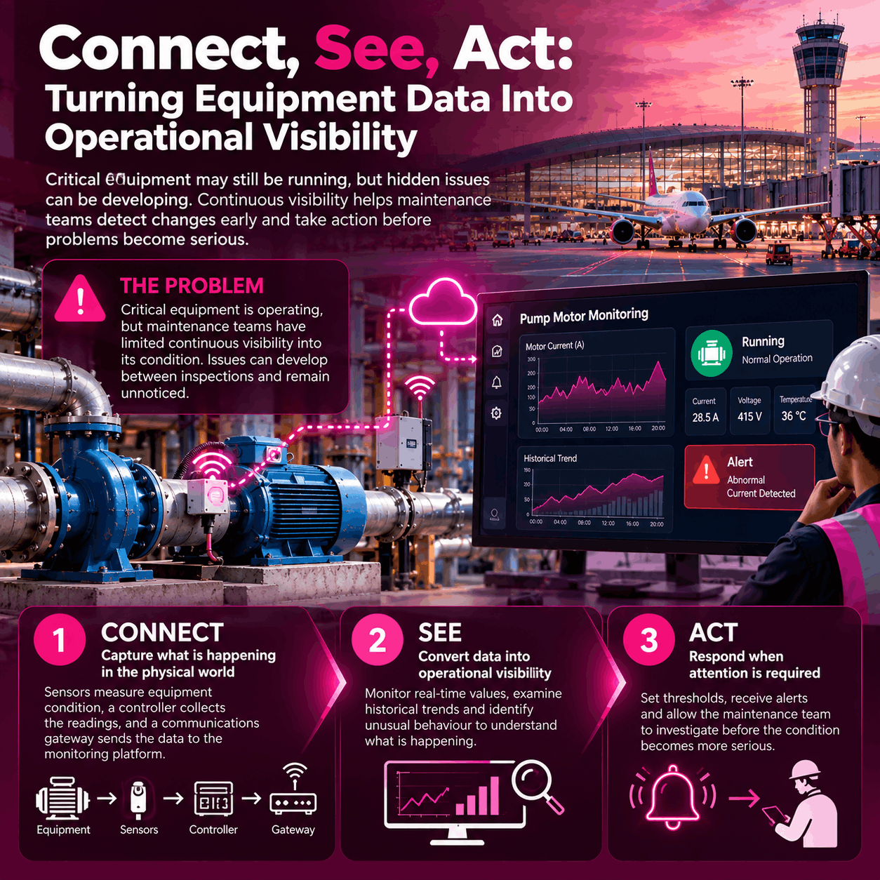
Connect, See, Act: Closing the Gap

This is the exact gap we built Favoriot to close, and I want to be specific about how rather than just asserting it. Our approach follows a simple sequence.

Connect. Pull readings from machines, PLCs, and existing sensors into one place, regardless of whether that equipment is ten years old or ten weeks old. Most plants run a mix of both and cannot afford to rip out working hardware just to gain visibility.

See. Turn that raw stream into a live picture of asset health that a supervisor, a plant manager, and a maintenance planner can all look at and immediately understand, rather than three different systems each showing part of the truth.

Act. The platform does not stop at a chart. It flags the anomaly before it becomes a stoppage, routes it to the right person, and keeps a record of what happened so the next technician facing a similar pattern does not have to start from zero.

That last part matters more than it might sound. Every alert that gets resolved becomes a small piece of institutional memory. Over time, a plant using this kind of system is not just catching problems earlier, it is quietly building the same kind of pattern library that used to live only in a veteran technician’s head. That is a meaningful answer to the retirement problem above, and it has nothing to do with predicting the future perfectly. It is about making sure knowledge does not evaporate every time someone retires or moves on.

What Visibility Can and Cannot Do

I want to be honest that visibility alone will not fix every downtime problem. Some failures are mechanical and will happen regardless of how good your monitoring is. Some are caused by upstream supply issues that no sensor can see coming.

What a connected view does is shrink the forty minutes of confusion down to something closer to four, because the moment the line stops, someone already knows what changed, when it started drifting, and what the last three similar incidents looked like. That compression, from confusion to clarity, is where most of the real savings live. It is rarely about preventing every failure. It is about not being blind for the first half hour of one.

Three Questions Worth Asking Your Own Floor

If you are running operations and want a quick gut check on where your plant stands, ask yourself:

  1. When a machine stops, how long does it typically take before someone knows the root cause rather than just the symptom?
  2. If your most experienced technician left tomorrow, how much of their troubleshooting knowledge is actually written down anywhere your team can access?
  3. Do your current monitoring tools give you one connected picture, or are they five separate screens that nobody has time to check at once?

Most plants I talk to already know the answers, and the answers are usually not comfortable ones. That discomfort is a good sign, honestly, because it means the problem is visible enough to fix. I would rather have a plant manager tell me their monitoring is fragmented than have them tell me everything is fine, because the second answer usually means nobody has looked closely enough yet.

Start Small, Prove It Fast

The plants that make real progress on this rarely do it in one big overhaul. They usually start with the single line or the single asset class that causes them the most grief, connect it properly, and let the team get comfortable with what a clear picture actually feels like before expanding further.

That approach also tends to build internal trust faster, because operators and technicians can see the tool catching something real in week one rather than waiting months for a plant-wide rollout to prove itself.

If any of this sounds familiar and you want to see what a Connect, See, Act view of your own floor could look like, we are always happy to walk through it with you. No pressure, just a conversation about where your blind spots actually are.

Copyright © 2026 All rights reserved